fbpx

What Pantone’s Color of the Year Tells us About 2024 Trends

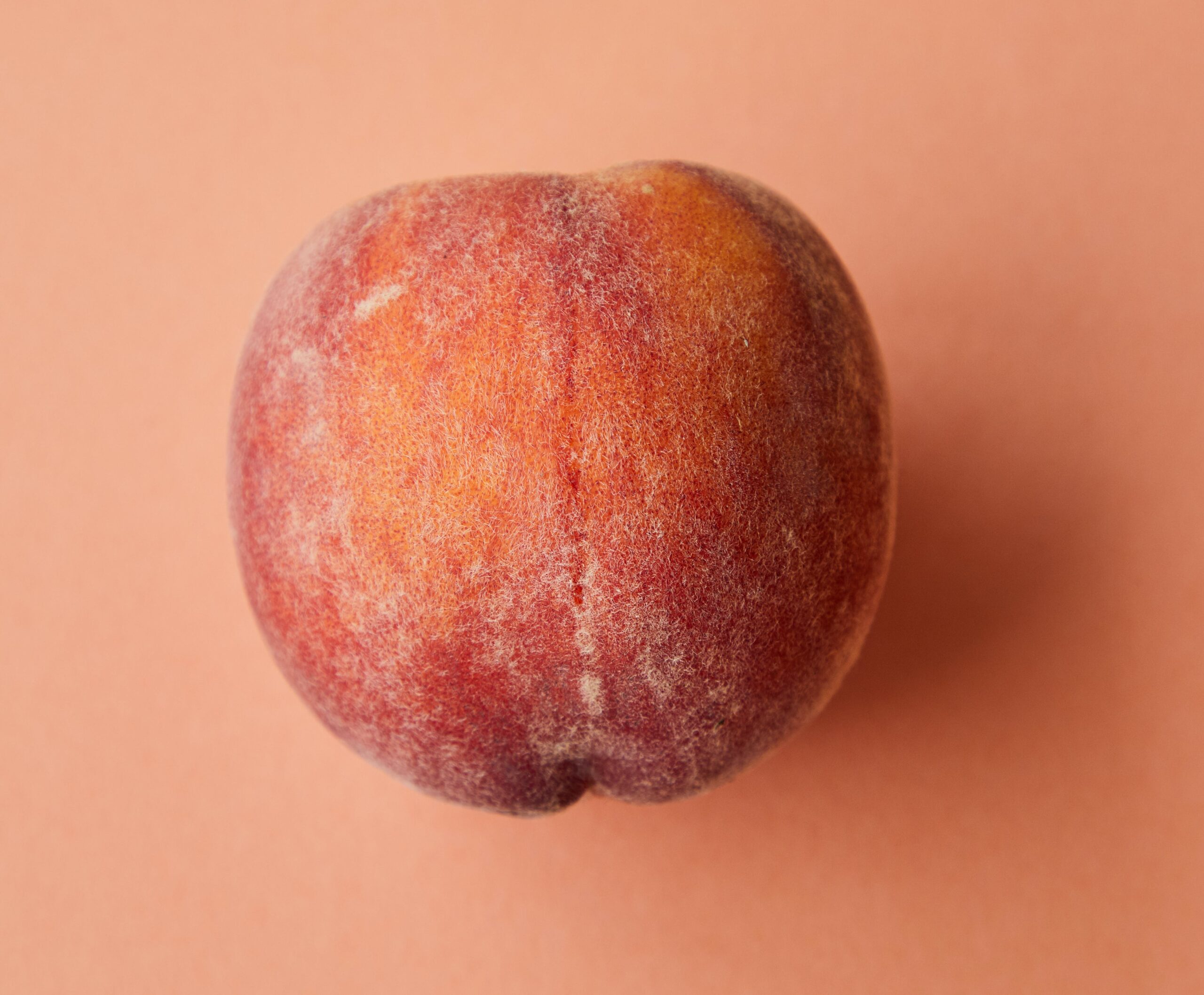
In the ever-changing world of design, Pantone’s Color of the Year is much more than a trendsetter. It’s a window into the collective mood and emerging cultural shifts. This year, Pantone brings us ‘Peach Fuzz’ for 2024, a color that wraps up warmth, community, and nurturing vibes into one delightful package.

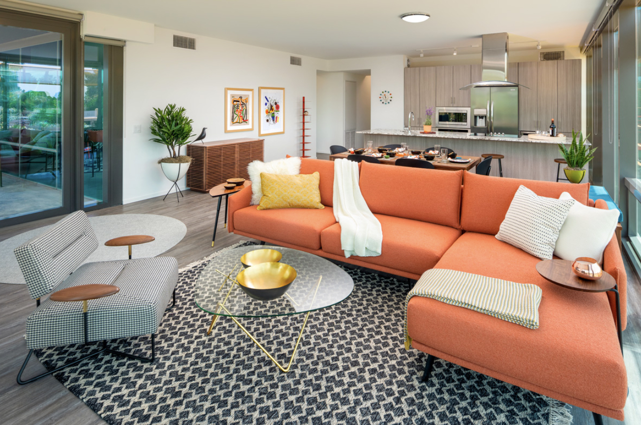
Pantone’s selection of Peach Fuzz, a hue that balances the vibrancy of pink with the warmth of orange, isn’t just a pretty shade. Pantone notes the color embodies a sense of nurturing and tenderness, offering tranquility in our fast-paced lives. Peach Fuzz symbolizes a shift towards gentleness, encouraging us to pause and appreciate the simpler aspects of life. It represents a move towards a softer approach in our interactions and environments, resonating with a contemporary yet timeless appeal. 

Credit: Karolina Grabowska, Pexels

The choice of Peach Fuzz for 2024 is a response to the growing desire for empathy and deeper connections in our society. This color reflects an understanding of the importance of mental and physical well-being, amidst our busy lives. It’s a call to embrace moments of peace, creativity, and human connection. Peach Fuzz is about fostering a sense of community and cherishing the time spent with friends and family. It highlights the trend towards valuing inner fulfillment and the joy of simple pleasures, aligning with a more thoughtful and intentional way of living.

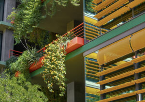
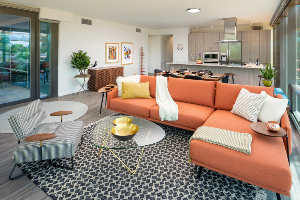
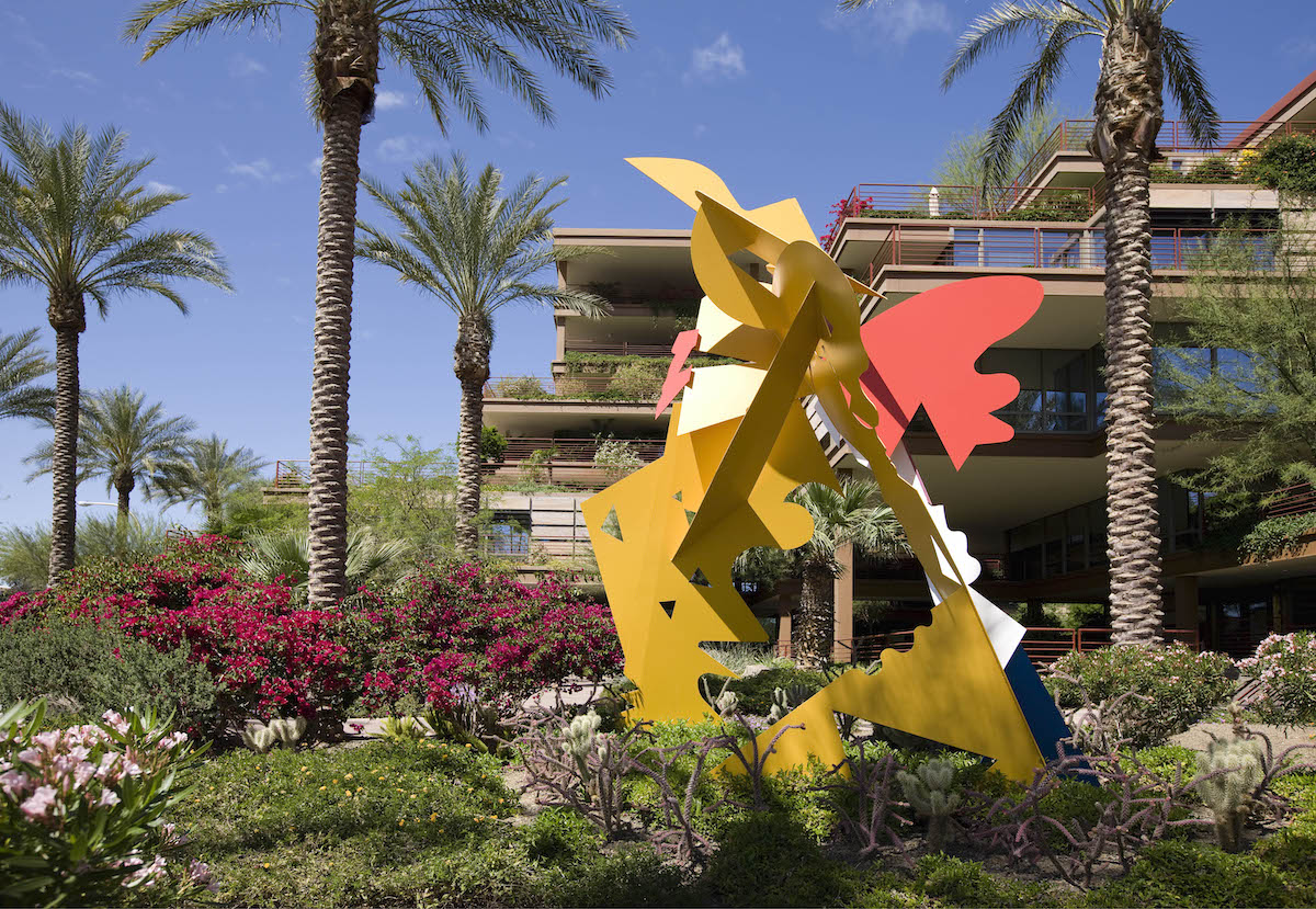
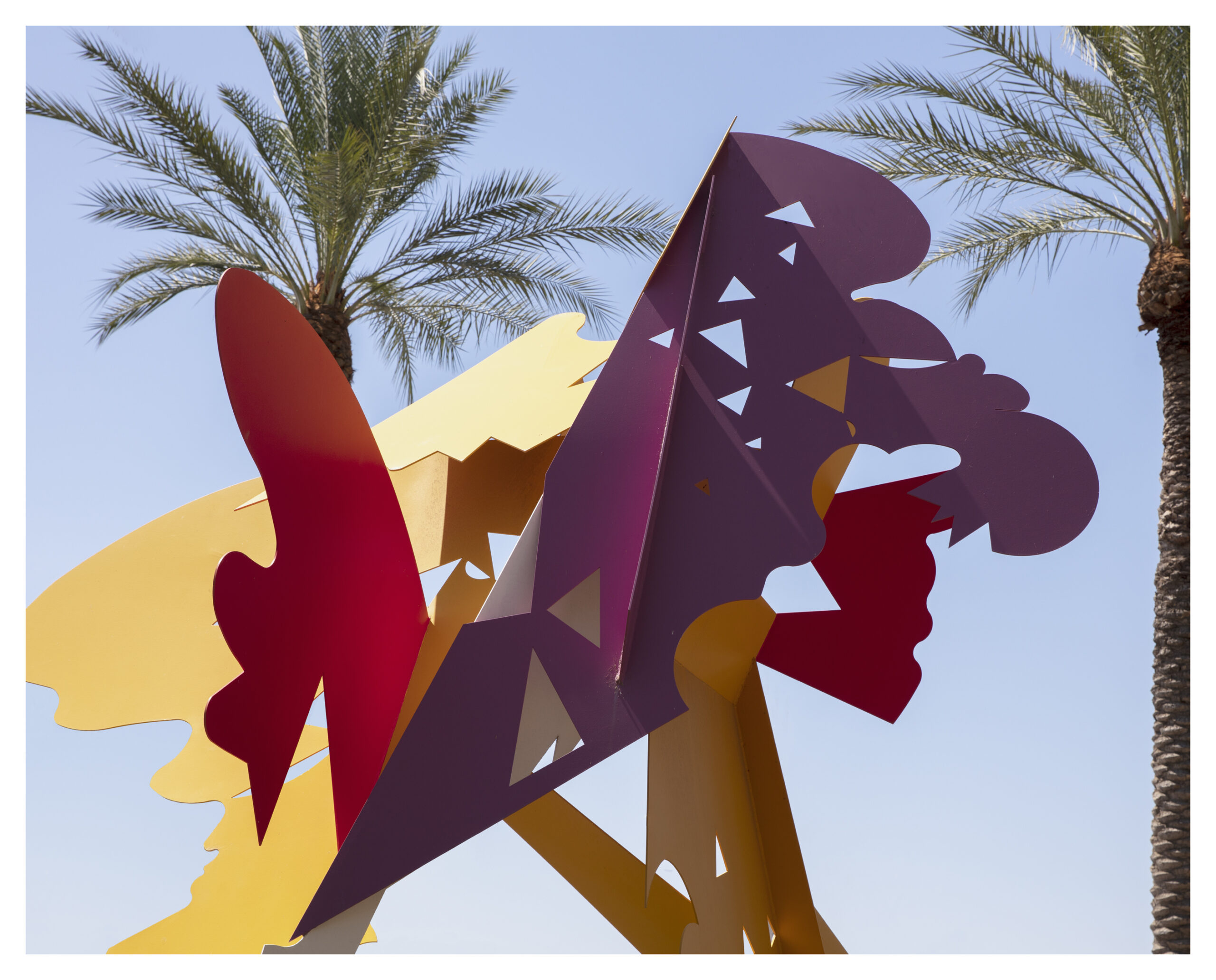
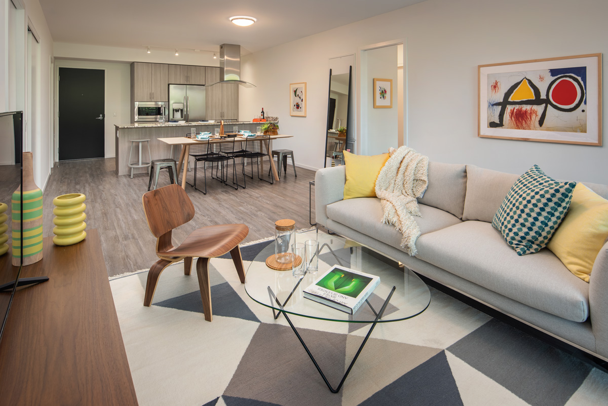
The selection of Peach Fuzz as Pantone’s Color of the Year for 2024 points towards a trend that deeply resonates with us at Optima: the gravitation towards earthy, outdoor, and nature-inspired aesthetics. This choice speaks to a broader cultural shift where design is increasingly embracing the warmth and tranquility of natural elements, reflecting a desire to connect more deeply with our environment. 

Credit: Leah Kelley, Pexels

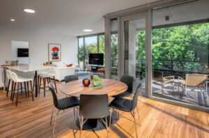
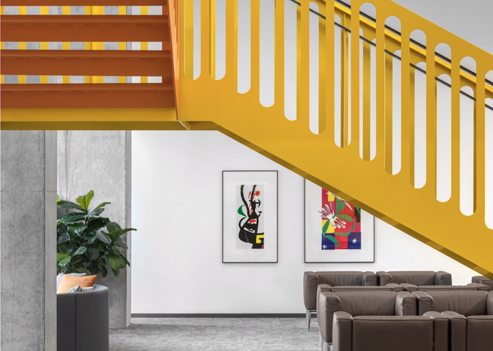
At Optima, this trend towards nature-centric design is something we have long embraced. Our commitment to creating spaces that are in harmony with the natural world is evident in every aspect of our communities. From the lush greenery that adorns our living spaces to the thoughtful integration of natural light and outdoor elements, we strive to create environments where nature and modern living coexist in balance. 

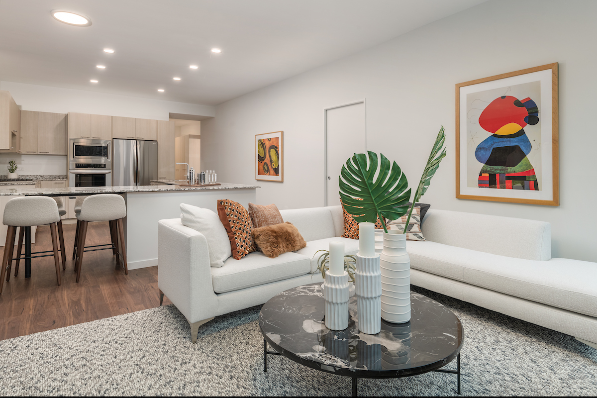
As we move into 2024, the influence of Peach Fuzz in design trends suggests a continuation of this journey toward spaces that celebrate the beauty and simplicity of the natural world. In embracing Peach Fuzz, we’re not just following a trend; we’re reaffirming our commitment to creating spaces that foster well-being, connection, and a deeper appreciation for the simple joys of life.

Ellison Keomaka Art at Optima Verdana

At Optima®, art is a piv-otal part of our design philosophy, breathing life into our spaces and making them more than simply places to live. We recently sat down with Ellison Keomaka – the artist behind the captivating work in Optima Lakeview and Optima Kierland Apartments – to delve into his creative journey, inspirations, and his special bond with Optima. In our conversation, he shed light on his process of creating the artworks exhibited at Optima Verdana, turning each corner into an expressive play of shapes and hues below: 

What did the creative process entail when first conceiving and planning the artwork for Optima Verdana? 

The artwork for Optima Verdana followed the work I created for Optima Kierland 7190. Interestingly, I integrated a few ideas and inspirations from my 7190 artworks into the pieces I crafted for Verdana. However, with the Verdana artwork, I wanted to integrate more of the earthy, verdant tones associated with the community. 

From left to right, Sunset and Matte by Ellison Keomaka at Optima Verdana

We’ve understood that you frequently experiment with diverse materials ranging from soil to fabric to add texture to your artwork. What materials did you utilize for these specific pieces, and why? 

I’ve been combining old and new elements in my work since my pieces for Lakeview and Optima Kierland 7180. I feel that this technique has been refined further in these new projects. For World Scapes in Optima Verdana, I created pieces measuring 20 by 30 inches, which is smaller than the pieces where I’ve previously incorporated magazines. It’s neat because I ended up fitting entire magazine ads in each piece, which ended up having a huge impact. 

It’s fun working with smaller pieces because they create a whole new vibe compared to the larger 48 by 60-inch pieces where I’ve had to stick a bunch of ads together to make it stand out. So using magazines on smaller canvases, like in World Scapes, introduces a refreshing dimension to the work. What I truly cherish about this work is the fusion of vintage and modern elements. The color of the paper, with its earthy tone, contrasts remarkably with the bright, modern colors.

Portals by Ellison Keomaka at Optima Verdana

I also utilized magazines for the Portals series at Verdana. These pieces consist of magazine clips I discovered that convey a sense of motion. Creating these pieces was quite a challenge. I needed to adhere the images to the canvas, and only after that do they get cut out. I drew the black lines first and applied the yellow background, then cut the images to fit the black lines. It was a delicate balance – waiting for the glue or polymer I use to reach the right level of dryness so I can still cut it. So those pieces were rather complex to create.

What role does color play in these works? 

Verdana stood out with its characteristic earth tones, marking a slight shift from the vibrant tones used in my work for other Optima buildings. My goal was to use more complementary colors to accentuate the warmer hues while preserving the vibrancy. I didn’t have a full understanding of the building’s size or the amount of art it would host, but I knew that Verdana was smaller. So, my approach was to focus more on the details and textures, magnifying them since they were less in quantity. The goal was to create an engaging experience for the residents.

From left to right, Swatches and Around by Ellison Keomaka at Optima Verdana

Blossoms are some of my favorite pieces that embody the earthy tones used throughout Verdana. They abstractly represent a cherry blossom tree. I’ve tried to deviate the image as much as possible from a recognizable tree, but I’ve preserved some elements like the blue texture, reminiscent of bark. Instead of literal flowers, I’ve scattered colorful dots throughout the piece, with a hidden explosion of color behind it all for contrast against the bright pinks. 

In the Around series at Verdana, you can see how I continued to experiment with different hues – the teal juxtaposed with a pinkish-mauve tone. These pieces were created using a unique type of graffiti ink pen. The pen’s shape left a more rounded edge to the strokes. Every piece is designed to fulfill a certain narrative, and in that journey, there’s always something that I find gratifying, whether it’s the balance, color, or textures. However, these pieces hold a unique place in my heart. 

Is there anything else we should know about the creative process for these pieces or the work itself? 

Creating a few of the pieces was extraordinarily challenging. One of the pieces in the Spring series stands out due to a five-minute variation in the timing of the spray application while the paint was still wet. I used a pressure sprayer and experimented with different paint viscosities to achieve the desired effect. Despite the difficulty, I love that they invoke a fresh, spring-like sensation. Since they’re smaller, I wanted to incorporate more texture into them. They feature different colored dots and are strongly influenced by Calder and Miró.

How Space Affects Mood

Today, virtually every aspect of daily life seems to bring a measure of stress. And when thinking about how to cope, it’s reassuring to turn to science, where research studies continue to point to the fact that human health and the spaces in which we live, work, and play directly correlate with stress levels and mood. Since our earliest years and projects, Optima® has championed the primacy of interior space, and we continue to celebrate its importance for each and every one of our residents — including giving a few tips on how to make the most out of one’s own space!

The Importance of Natural Light

Previously, we’ve spoken about the positive effects of an abundance of natural light and expansive windows and the critical role they play in adhering to our principles of Modernist design. Sunlight alone holds many benefits that go beyond the physical. It helps increase serotonin and endorphin levels, two hormones that significantly boost our mood.

What simple steps can you take to maximize natural light in your space? Start by arranging mirrors to reflect light, making sure you’re not blocking light with furniture, and rethink the use of dark drapes or shades.

Natural light at Optima Lakeview®, Chicago, IL

Perception

The impression a space makes affects your mood, as well, and happens on an immediate and intuitive level as your mind and body engage with the physical environment. Picture an expansive living/dining area with floor-to-ceiling windows where you are drawn to gather with family and friends (or curl up with your pooch). Juxtapose that impression with what you would feel when entering a cluttered, dim room with little space to move around.

Take advantage of the layout of your space to maintain a sense of effortless flow in and around furniture and built-in elements, and keep piles and stacks to a minimum!

Introducing Color 

Color isn’t merely visual eye candy, it provides a psychological experience, as well. Beyond the sense of tranquility that the Modernist palette of monochromatic tones of gray, white, and black offer, expanding your space’s palette can make a world of difference in boosting your mood. 

Extending a hand to vibrant colors like red, yellow, or orange can give you feelings of passion and comfort. Cooler colors on the other side of the spectrum, like blue, green, and purple, can be peaceful, calming, or comforting. Sprinkling bits of color throughout your space is a surefire way to add a new emotional dimension to the environment and enhance your mood. 

Terrace gardening at Optima Sonoran Village®
Vertical landscaping at Optima Sonoran Village®

Budding Companions Can Increase Mood

We’ve written in the past about the mental health value of introducing budding companions such as house plants or flowers into your space, based on the results of comprehensive studies that show how the presence of plants improves concentration and memory retention while also reducing stress.

Make a regular habit of keeping plants and flowers around your home, and enjoy their affect of reducing the likelihood of depression and increasing positive feelings — in addition to the aesthetic beauty they provide.

From the feedback we continue to receive from Optima® residents, living in one of our communities sets the stage for high spirits and upbeat moods. With “great bones” in the design of our residences, optimized for openness, materiality and light, the opportunity to transform living space into home becomes a joy.

Modern Decor For Your Home

At Optima, our affinity for modern design and style stretches through all of our Communities. In the past, we’ve explored the history and identity of modern furniture, but we’ve never touched on the defining elements of modern decor. So, if you’re looking to elevate your home with a modern eye, look no further:

Like design, remember that with modernism, form follows function; this means that every decor element you have should always reflect its intended purpose. Avoid inserting decor that doesn’t add supplementary function or purpose to your home. However, this doesn’t mean that your decor has to be limited; many modernist designs also embrace vibrant colors, unique shapes and various materials.

Embrace The Light 

One key trait of modernism is utilizing and celebrating a space’s natural light. For windows, modesty is key; even with curtains, use soft and sheer fabrics to keep it minimal. Another great way to stretch the natural light in your home and manipulate space is by adding mirrors to your interior. Hang mirrors where they’re most practical in your home. Rooms that have limited light and feel small may benefit from a large mirror, and it might make sense to place a mirror across from your home’s beautiful view or a statement piece.

brightly lit living room with an orange sofa, patterned rug, glass accent table, and other modern home decor
Vibrant colors and organic textures in an Optima Sonoran Village residence

Introduce Texture & Color

Whether you start with the living room or the bathroom, introducing organic textures to your home is a great way to welcome modern design. Bring the outdoors in with furniture and decor elements that feature natural wood and stone. Other warm textures like leather and natural fibers make fantastic options for complimenting other modern features of your home. Modern design and warm elements don’t have to conflict with one another.

To some, modernism is only associated with monochromatic tones like gray, white and black, but extending pops of vibrant color throughout your home is a great way to add life to the environment. Place a bright-colored rug in the center of a large room or go all natural and bring in lush greenery and foliage.

Modern decor and design continue to be timeless templates for accessorizing homes. Whether you start utilizing your home’s natural light or mix in a splash of color, there are countless ways to embrace modern decor throughout your home.

Public Art in Chicago’s Lakeview Neighborhood

As we continue to explore the dimensions of Chicago’s Lakeview neighborhood that make it so unique and dynamic, we’re showcasing one of the community’s most significant ongoing projects, a thoughtful offering of public art to the city, the Lakeview Public Art Program

Because the Lakeview creative community has a long history of celebrating art and culture, even the most casual stroll through the neighborhood reveals an abundance of public art installations. And thanks to the Lakeview Public Art Program, the neighborhood is growing its collection of murals and sculptures, while hosting cultural events and other artistic happenings that support emerging artists. 

The Lakeview Public Art Program is run by the Lakeview Public Art Committee, a diverse group of volunteers responsible for finding forward-thinking, culturally-aware artists. Working in collaboration with Lakeview Roscoe Village Chamber of Commerce and Special Service Area (SSA) 27, the Committee supports and advances the non-profit Friends of Lakeview, an organization dedicated to improving and enhancing public streets and spaces, creating memorable experiences, and promoting the neighborhood.

Many of the artists whose work has been commissioned by the Lakeview Public Art Committee are Chicago natives themselves, like Anthony Lewellen; you can see his mural titled Lake View in the geographical heart of the neighborhood, at the corner of 3241 N. Lincoln Ave. For this mural, the artist took inspiration from memories of growing up in Lakeview. This 4,000 square foot wall painting displays a girl holding binoculars looking at Lake Michigan with the rest of Chicago behind her. The girl personifies the neighborhood itself, as she looks toward a horizon of opportunity.

A mural painted on a the side of a brick building depicts a woman gazing onto Lake Michigan with the skyline of Chicago behind her.
Lake View, Anthony Lewellen, Courtesy of Lakeview Public Art Program

Another mural commissioned by the Committee is Felix Maldonado’s Bears on Parade, which can be seen at  3409 N. Ashland Ave. Maldonado drew inspiration from the fact that in the 18th century, this area of Lakeview was once inhabited by the Miami, Ottawa and Winnebago Native American tribes. Featuring a group of bears and cubs walking through a blue forest, this mural celebrates the neighborhood’s culture and history while also subtly referencing the city’s favorite sports teams. 

With Optima’s commitment to thought-provoking, inspiring art in and around our properties, we are proud to join the Lakeview neighborhood, and celebrate its commitment to public art and talented artists.

Ellison Keomaka’s Art at 7140 Optima Kierland

Pairing unique, tasteful works of art with our buildings is an integral part of design expression with Optima projects. We recently sat down with artist Ellison Keomaka, to discuss the process and inspiration for his most recent contributions to 7140 Optima Kierland. – you can read more about our history with Keomaka here

While creating commissioned artwork for 7180 Optima Kierland last year, Keomaka was simultaneously working on pieces for 7140. “Because I was working on these two bodies of work at the same time, much of the inspiration for the 7140 artwork flowed from what I was creating for 7180,” says Keomaka. 

Armed with an understanding of the building’s design, materiality and sense of space, Keomaka decided to explore a grand palette, bold textures, and adventurous methods — “a playground of color and an exciting experiment,” explains Keomaka. 

Letters From Home at 7140 Optima Kierland

Partially inspired by his own experience in the military, Letters From Home is an “assemblage work” as Keomaka explains, “that speaks to the emotional stories of soldiers receiving letters from home.” The assemblage includes images from issues of Life Magazine that date back to World War II, with two blocks of bright blue and red that meet to form a shape that resembles the back of an envelope.

Some Kind of Sunset at 7140 Optima Kierland

Keomaka’s personal favorite, Some Kind of Sunset captures the idea of the endless shifts in the sun’s position. Working over a period of two months, Keomaka used pearlescent and fluorescent paints to animate the surface of the canvas, allowing the colors to adapt and change with changes in the natural light striking the surface throughout the day.

Desert Dance at 7140 Optima Kierland

As the title suggests, Keomaka created this piece as a kind of dance that responded to music he was listening to while painting. “Working with music is a big part of my artistic practice,” Keomaka states. “For this work, I was listening to a playlist that included Kanye West, Coldplay and movie soundtracks, and I used my brushstrokes and color choices to respond to the eclectic mix,” he shares.

The Space Between at 7140 Optima Kierland

Comprised of vertical bands of bright colors, The Space Between may seem like it is one of the more simple works of art created by Keomaka for 7140 Optima Kierland. However, color and texture are precisely what make this piece stand out. Keomaka mixed primary colors to create unique hues that live in the spaces between yellow, blue and red, while using a squeegee tool to control the flow and texture of the paint on the canvas to add to the sense of flatness and precision.

Keomaka’s bold and experimental artwork echoes the creative brilliance and ingenuity that we care deeply about at Optima. His ability to translate these artistic gestures into works that activate the public spaces at 7140 Optima Kierland add immeasurably to the beauty and warmth of the interior environment — for residents as well as for all who pass through the building.

An Inside Look at Architect Lingo, Part V

Interior of Relic Rock, Optima DCHGlobal, demonstrating the Corbusian principle of the free ground plan

An intricate and technical field, the world of architecture produces a unique dictionary of jargon all its own. At Optima, our team works in a highly collaborative atmosphere where we all, from architects to property managers to construction superintendents, share ideas and hold conversations across disciplines — so naturally we all encounter the lingo of our architects. As part of our ongoing series “An Inside Look at Architect Lingo,” today we continue to decode the secret language that we’ve all come to know and love.

Corbusian

Just like the word Miesian from our previous installment in this series, Corbusian is a homological word that nearly explains itself. It refers to anything of, pertaining to, or characteristic of the Swiss architect Le Corbusier. Of the many narratives and philosophies he published, Le Corbusier famously published the seminal L’Espirit Nouveau in 1920, revealing his famous “five points of architecture.”

These five points include the pilots (a grid of concrete or steel columns replaces the load-bearing walls), the roof garden (vegetation or landscaping that covers a rooftop), the free ground plan (the absence of load-bearing walls allows flexible use of the living space, which can be divided by screen elements), the horizontal windows (cut through the non-load-bearing walls along the facade and provide the apartment with even light), and the free façade (pen and closed sections on the façade enable the separation and connection of the exterior design from the building structure). Anything including these characteristics, then is Corbusian.

Rendering of Optima Verdana

Mullion 

As exotic as the word sounds, the definition for mullion is pretty simple. A mullion is any vertical element that forms a division between units of a window, door, or screen. This division can be both functional or purely decorational. When dividing adjacent window units, the primary purpose of a mullion is to provide a rigid support to the glazing of the window. 

In Modernist architecture then, where endless glass curtain walls abound, the mullion becomes an integral part of maintaining the structural integrity of these all-glass fixtures. 

Muntin

Muntin is not to be confused with the above mullion, though the two do share similarities. Muntin refers to a rabbeted (or recessed) member for holding edges of window panes within a window sash. Muntins are also sometimes called glazing bars or sash bars. These days, muntins are often decorative in nature, ranging from the simple to the complex – often a counterintuitive design element in Modernist disciplines.

However, as you might recall from our blog on the history of glass, at one point in time it was extremely rare to obtain large panes of glass. Everything was built by patching very small and very expensive panes of glass together, and in this context, muntins were extremely critical.

Stay tuned for future features on the world of architecture lingo at Optima.

Sculpture Spotlight: Sundance

As devout fans of Modernism, at Optima we love to experiment with form and function. That’s how Optima Co-Founder David Hovey Sr. got into sculpture. Combining his love of art with his interest in materials, David Hovey Sr. began manipulating steel to create striking sculptural pieces that play to Optima’s architectural spaces. Today, we’re examining one of his sculptures: Sundance.

While many of our sculptures manifest in a variety of sizes and colors, Sundance is notable because of its goliath frame. Standing at thirteen feet tall, this impressive structure and its bold angles make a lasting first impression. The piece expresses the nature of the thin steel plate from which it was fabricated, showcasing structural potential with three-dimensional, dynamic components and an inviting sense of openness.

It’s no coincidence that Sundance is nestled in the landscaped courtyard of Optima Camelview Village. Sundance is built literally and metaphorically to connect to the ground, giving the sculpture context and roots within space. Meanwhile, being swathed in vibrant primary hues, the sculpture plays complement to the property’s red architectural details and the vibrant color palette displayed throughout the gardens.

Another perspective of Sundance sculpture

Whether we’re experimenting with form, function, size or color — at Optima we love to playfully implement sculpture as yet another component of thoughtful design.

The Life and Work of Henri Matisse

Henri Matisse is often regarded as the most important French painter of the 20th century. Leader of the Fauvist movement, his work was expressive, colorful and rigorous, often depicting flattened forms and decorative pattern. He operated with a unique way of seeing, stating, “I don’t paint things, I only paint the difference between things.” To understand the influential work of one of art history’s greatest minds, we first examine his life.

Henri Matisse working on a cut paper collage, a preferred medium in his later years after falling ill.

Matisse’s Early Life

Henri Émile Benoît Matisse (1869 to 1954) was a draughtsman, printmaker and sculptor, most renowned for his work as a painter. Born to a wealthy grain merchant in Northern France, he first studied law before finding his calling as an artist. His mother gifted him art supplies during his recovery from appendicitis. Through the gift, Matisse discovered “a kind of paradise” in creation, and made the decision to abandon law for a lifelong pursuit in art. 

In the last decade of the 19th century, Matisse studied art in Paris, and was influenced by the work of early masters and modern artists such as Jean-Baptiste-Siméon Chardin and Éduoard Manet. However, an 1896 trip to the island of Belle Île introduced Matisse to Australian painter John Russell, who then introduced Mattisse to Impressionism and the work of Vincent van Gogh, Russell’s dear friend. Seeing the vibrancy of Impressionism and van Gogh’s work, Mattisse’s style transformed with brilliant hues. Of his experience with Russell, Matisse said he, “explained colour theory to me.” 

The Red Room (1908), Henri Matisse.

The Art of Matisse

After time spent learning from Russell, Matisse was plunged into the world of Fauvism at the turn of the century. The style began around 1900, continuing beyond the first decade. Part of an innovative group later dubbed “Fauves,” Matisse explored his new understanding of color through paintings with tones bright, clashing and dissonant from those natural to their subject. Even though he helped to pioneer Fauvism, Matisse never really fit in with the crowd due to his conservative appearance and strict bourgeois work habits. And although the radical movement eventually declined, Matisse nevertheless forged on. 

The work that Matisse created during this period set the stage for the work he would create for the rest of his career. His focus on color continued, explored through what he called “construction by colored surfaces.” Even as his style and subject matter changed from abstract, to decorative interiors, to cut-out paper collages at the end of his life, this approach remained the same.

We are lucky to hang the work of Henri Matisse in our own communities. His consideration of form and color is reflective of our own thought process, and serves as a reminder that while style may change over time, a well-formed approach will always shine through.


The Work of Joan Miró

It’s no secret that we love color. We believe that color, like art, brings a new dimension to the beautiful spaces that we design. That’s why the colorful and surrealist work of the Spanish painter, Joan Miró, is a natural fit to enliven the walls of our communities.

Portrait of Joan Miró

The Life of Joan Miró

Miró was born in 1893 in the seaside town of Barcelona. He grew up influenced by the beauty and culture of his city, and surrounded by the arts with a watchmaker father and goldsmith mother. His began drawing as a young child, though he diverted from his true calling when he went to business school for college. After school, Miró worked as a clerk, but quickly found his way back to art, evolving through several styles and artists’ circles and leaving an influential mark in his wake. 

The Art of Joan Miró

Miró’s early work was inspired by Vincent van Goh and Paul Cezanne. By 1919 and his first trip to Paris, Miró began to dabble in geometric, patterned art inspired by the Cubists. In the early 1920s, Miró began to draw inspiration from Sigmund Freud and the Marxists, joining the ranks of the groundbreaking surrealists with work marked by lines, organic shapes and color. Miró himself once said, “I try to apply colors like words that shape poems, like notes that shape music.”

The Red Sun, 1950, Joan Miró at Optima Sonoran Village

We are proud to enliven our interior spaces with the art of Joan Miró, and are deeply moved by the power of his works and words. Miró’s work adorns the walls of a handful of units at Optima Sonoran Village, playing off the lively interiors and lush outside landscape. Like Miró, we too, try to apply colors, and art, to shape the beautiful spaces that we design.

person name goes here

Maintenance Supervisor

Glencoe, IL


    Acceptable file types: *.pdf | *.txt | *.doc, max-size: 2Mb