fbpx

An Eero, A Deere, and Clouds: How John Deere and Eero Saarinen Inspired Georgia O’Keeffe’s Largest Painting

Sometime in 1965, on a hot summer day at her Ghost Ranch house in New Mexico, Georgia O’Keeffe would find the motivation to complete her most grandiose painting yet, Sky Above the Clouds IV. Little did we at Optima® know, however, that the luminary architect and industrial designer, Eero Saarinen, alongside legendary agricultural corporation, John Deere, would play a pivotal role in the creation of this monumental painting.

Tracing back to June 4th, 1964 is when the story behind Clouds IV gets interesting. O’Keeffe attended the opening of the new headquarters of Deere in Moline, Illinois. Designed by the office of Eero Saarinen, the structure’s pre-rusted Cor-Ten steel exterior tested the limits of 1960s corporate architecture, veering towards an industrial aesthetic quite unique from Saarinen’s usual swooping curves, as seen with the Gateway Arch in St. Louis.

Picture the opening ceremony — a lavish and extravagant affair, showcasing top-of-the-line farm machinery, along with an evening river cruise — with politicians, corporate czars and design stars in attendance. So why was Georgia O’Keeffe, “The Mother of American Modernism” there to begin with? Well, archival photos show that she was mingling with this elite crowd against a backdrop of John Deere tractors. In just about every photo she is seen with her close friend and fellow New Mexican, designer Girard Alexander. Girard had invited O’Keeffe for two reasons. He wanted to showcase his 180-foot-long collage installation documenting the culture and development of John Deere. More importantly, however, was his belief that an O’Keeffe painting would further transform the interior of their cutting edge new headquarters.

Upon her return to New Mexico. O’Keeffe executed a detailed sketch depicting the uniform cumulus clouds that she thought of whenever flying from one destination to another — hence, Sky Above the Clouds I-IV. Where would an O’Keeffe painting go in a building whose every element had been designed and polished to near perfection? 

From its pre-rusted steel exterior, down to the last coat rack and door handle. Girard knew of such a place: the executive dining room. This room was equipped with tantalizing Siamese silk ceiling panels that hung perpendicular to its sublime Portuguese white marble walls. The architectural effect was, by all intents and purposes, cloud-like. Sky Above the Clouds IV would have only elevated this effect, Girard thought, but the Deere team didn’t see it that way, unfortunately, and the commission was axed. 
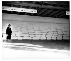
Georgia O’Keeffe in Garage
Georgia O’Keeffe in Ghost Ranch Garage with “Sky above Clouds IV” (1966), Photo: Ralph Looney

She was in the midst of a busy year. Full of other work, international travel, and even a harrowing knee injury that she was recovering from. Fortunately for us, O’Keeffe persisted in her desire to see Clouds IV to the end. She completed the work, at the age of 77, in the summer of 1965. 

In 1970, Sky above Clouds IV was scheduled to be included in a retrospective of O’Keeffe’s work at the Whitney Museum of American Art, New York, the Art Institute of Chicago and the San Francisco Museum of Art. After being shown in New York and Chicago, the painting remained on loan to the Art Institute because it was too large to pass through the doors at the museum in San Francisco. Ten years later, due to the diligence of O’Keeffe and local patrons, the painting joined the museum’s permanent collection. Today, this 8-foot by 24-foot masterpiece hangs above one of the Art Institute’s grand staircases for all to see.

Ellison Keomaka Art at Optima Lakeview

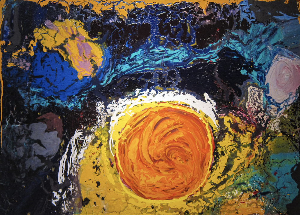
Optima Communities wouldn’t be the same without the striking artwork that fills their public spaces, ensuring a playground of form and color around every corner. Recently, we sat down with artist Ellison Keomaka – who previously contributed to 7140 Optima Kierland and our other Arizona properties – to discuss the process and inspiration behind the 80 unique artworks that now call Optima Lakeview home. 

What did the creative process look like when first conceiving and planning the artwork? How did the architecture and design of the building influence and inspire your piece?

When we first began talking about the project, I didn’t realize I was going to be creating artwork for the majority of the building, which was kind of a first for me. And after touring Optima Lakeview in 2021, I realized that I was going to be able to take advantage of its grand layout. 

Funlove 0022 and 0011 by Ellison Keomaka at Optima Lakeview

I set out to create a modular system where I could make everything unique. And yes, some paintings share the same colors, but each one is still different. I created the paintings in sets of, on average, seven pieces, separated by size and painted to adapt to any space. My ultimate goal was for building residents and visitors to see something new when walking the corridors and never see the same painting twice. So that was my aesthetic mission — to create an experience for the people in the building to have an indoor gallery where they can see all these different pieces come together. 

We’ve learned that you’re often experimental, using anything from soil to fabric to add texture to your artwork – what materials did you use for these particular pieces, and why?

I used a significant amount of spray painting here. Street art has been a huge influence on my career and I wanted to incorporate that into my work. I find spray paint offers a very unique texture, so I used it liberally in these particular paintings. I also used pages from magazines, many of which were from the 50s and 60s. In a few of the works, I was able to incorporate original Chicago Cubs advertisements as a way to add a subtle historical element. 

Ellison Keomaka working on the Creamsicle series, Courtesy of Ellison Keomaka

What role does color play in this work?

I worked with Optima’s signature use of bold, bright contrasting colors when creating much of the work. When I toured Optima Lakeview, I was able to see the colors of the atrium, specifically the vibrant red beams used throughout the skylights. And even though the building wasn’t completely finished, I knew exactly what color palette I wanted to incorporate.

I also tried to push the envelope with some of the colors. Some of the blues are off-blues or a little bit away from the primary color. And then there are the paintings that are yellow, red and blue – Primary 3 – that look simple but were actually very challenging for me in their own way because, as an artist, I always like to do more instead of trying to do less. There are also spray-painted pieces that include brownish blues, called Smores, which I originally called Earth Wind and Fire after the band from Chicago. They include this coffee brown with really bright blues mixed into it, which I thought was a fun way to bring warmth into the pieces while still maintaining a bold standard of color.

Airmax 001 by Ellison Keomaka at Optima Lakeview

You’ve talked to us before about how working with music is a large part of your artistic practice. Did music have any role in your creative process for Optima Lakeview’s art?

I think it always does for me. For the first pieces I created, the YBG series, I remember listening to The Weeknd’s After Hours album. I had all of the pieces lined up and was dancing around, having so much fun with them. It was almost like a childlike experience where I didn’t have any rules and was very free with the motions. There was no rhyme or reason, and I let the shapes do their thing. I used an acrylic paint pen to pull some bold black sweeping lines. They reflected the freedom of movement I felt while listening to music. So again, the music made it pretty fun. 

Ellison Keomaka working on the Creamsicle series, Courtesy of Ellison Keomaka

Four particularly special pieces live in Optima Lakeview’s lobby – the Mindscapes. How do those differ from the other pieces in Optima Lakeview and what makes them so unique?

The Mindscapes are a grand project I’ve been developing for the past couple of years. They’re each a visual time capsule that are just really fun to observe. They capture a dream state of imagination with abstract colors and shapes but then incorporate these very clear images of historical moments or memories. Everything found in them is relevant to Chicago, from old newspaper clippings about Lakeview restaurants and high schools to Cubs momentos. Each piece is totally unique, and they all include little hidden stories. Again, I wanted people to be able to walk around, stare at a painting for a little while and come back to see something they hadn’t seen before. 

A piece from the Mindscapes series by Ellison Keomaka at Optima Lakeview

Anything else we should know about the creative process for this piece or the work itself? 

A few of the pieces are inspired by landmarks in the neighborhood, specifically Red Totem, which is based on Kwanusila found in Lincoln Park. When I was doing my research on the community, I found the totem and liked the colors, which I then used in the painting. Others, like the Fun Love series, were more dynamic because they all had the white splatter that almost becomes energizing when you look at them. Those took the longest time for me to feel like they were complete, because of all the layers of paint that had to dry. 

The 80 paintings that fill Optima Lakeview mirror the vibrant aesthetics that we strive to create in our communities. As with every piece of artwork that we display in our built environments, Ellison Kemoaka’s bold and inspiring work brings a unique story for residents as well as anyone who passes through the space to discover. 

Ellison Keomaka’s Art at 7140 Optima Kierland

Pairing unique, tasteful works of art with our buildings is an integral part of design expression with Optima projects. We recently sat down with artist Ellison Keomaka, to discuss the process and inspiration for his most recent contributions to 7140 Optima Kierland. – you can read more about our history with Keomaka here

While creating commissioned artwork for 7180 Optima Kierland last year, Keomaka was simultaneously working on pieces for 7140. “Because I was working on these two bodies of work at the same time, much of the inspiration for the 7140 artwork flowed from what I was creating for 7180,” says Keomaka. 

Armed with an understanding of the building’s design, materiality and sense of space, Keomaka decided to explore a grand palette, bold textures, and adventurous methods — “a playground of color and an exciting experiment,” explains Keomaka. 

Letters From Home at 7140 Optima Kierland

Partially inspired by his own experience in the military, Letters From Home is an “assemblage work” as Keomaka explains, “that speaks to the emotional stories of soldiers receiving letters from home.” The assemblage includes images from issues of Life Magazine that date back to World War II, with two blocks of bright blue and red that meet to form a shape that resembles the back of an envelope.

Some Kind of Sunset at 7140 Optima Kierland

Keomaka’s personal favorite, Some Kind of Sunset captures the idea of the endless shifts in the sun’s position. Working over a period of two months, Keomaka used pearlescent and fluorescent paints to animate the surface of the canvas, allowing the colors to adapt and change with changes in the natural light striking the surface throughout the day.

Desert Dance at 7140 Optima Kierland

As the title suggests, Keomaka created this piece as a kind of dance that responded to music he was listening to while painting. “Working with music is a big part of my artistic practice,” Keomaka states. “For this work, I was listening to a playlist that included Kanye West, Coldplay and movie soundtracks, and I used my brushstrokes and color choices to respond to the eclectic mix,” he shares.

The Space Between at 7140 Optima Kierland

Comprised of vertical bands of bright colors, The Space Between may seem like it is one of the more simple works of art created by Keomaka for 7140 Optima Kierland. However, color and texture are precisely what make this piece stand out. Keomaka mixed primary colors to create unique hues that live in the spaces between yellow, blue and red, while using a squeegee tool to control the flow and texture of the paint on the canvas to add to the sense of flatness and precision.

Keomaka’s bold and experimental artwork echoes the creative brilliance and ingenuity that we care deeply about at Optima. His ability to translate these artistic gestures into works that activate the public spaces at 7140 Optima Kierland add immeasurably to the beauty and warmth of the interior environment — for residents as well as for all who pass through the building.

The Work of Anita Malfatti

There have been many leading ladies in the history of Modernism; one of whom is Anita Malfatti. Malfatti is widely regarded as the pioneer of the Modernist movement in Brazil — sharing with her home country the style that had already taken American and European culture by storm — and leaving behind a life that would inspire generations to come. 

Life in Brazil

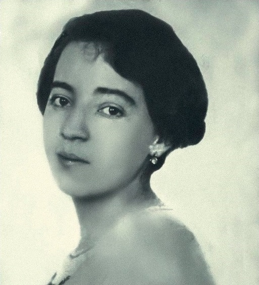
Anita Malfatti was born Ana Catarina Malfatti in Sao Paulo in 1889 to a family of immigrants; her father was a civil engineer and her mother was a painter, and a highly-cultured woman. Malfatti’s mother was her primary teacher, and a huge source of inspiration as Malfatti began to explore creatively while growing up. Due to a congenital defect that made her left arm nearly immobile, Malfatti was forced to paint right-handed even though she was left-handed. Nevertheless, Malfatti wasn’t deterred from her passion for the visual arts.

Pursuing art in Brazil was limiting at that time. The country lacked cultural institutions and had a limited scope of art theory compared to its global counterparts. Much Brazilian art at the time was in the classical, romantic style and was concerned with nationalistic interpretations of Brazilian pride and culture. So while Malfatti began her studies at Mackenzie College in Sao Paulo, the local arts scene was not enough to satiate her curiosity, and in 1912, she left for Berlin.

Anita Malfatti, Festejo na Roca. CMMECPC. (2023-10-05). MMEC 029/2015: Retrieved from museum-digital Brazil

The Work of Anita Malfatti

In Berlin, Malfatti spent four years studying at the Royal Academy of the Arts under famous expressionist artists. There she began to hone her artistic style of expressionist portraiture and metal engraving. After, Malfatti returned temporarily home to host her first solo show in Brazil in 1917-1918. The show received negative reception and was seen as too modern, bizarre and self-indulgent. 

Despite the uproar at the time, that solo showcase was the first introduction of Cubism, Expressionism, Surrealism and Futurism in Brazil. Recognition of Malfatti’s innovation was soon to come in Brazil. In 1922, Malfatti returned to Sao Paulo festival, The Week of Modern Art, in 1922, alongside other Brazilian Modernist artists (Tarsila do Amaral, Mario de Andrade, Menotti del Picchia, Oswald de Andrade), earning themselves the name  “The Group of Five.” The group’s presence that year made revolutionary strides in how Modern art was perceived and utilized in Brazil.

Malfatti continued to explore her artist expression, leaning towards the naive and folkloric later in her life, until she eventually died in 1984. By then, her influence on the artistic DNA of Brazil was undeniable, and her impact on Modernism remains profound today.

The Work of Paul Klee

Art plays a large role in our lives — from influencing our approach to Modernist design to transforming the spaces that we create. The repertoire of artists whose work hangs in Optima buildings is expansive, from Pablo Picasso to Joan Miro, and today, we’re spotlighting another one of our great featured artists: Paul Klee.

The Life of Paul Klee

Paul Klee was born in Münchenbuchsee, Switzerland in 1879 to a German father, inheriting his father’s German citizenship at birth. Klee’s father was a talented music teacher who passed on his knowledge to Klee. By age eleven, Klee’s proficiency at violin was so impressive that he was invited to join the Bern Music Association.

Klee’s creative proficiency extended to the visual arts. And while he pursued music per his parents’ wishes, by his teenage years, a desire to rebel and to seek his true passion led him to studying art.

The Work of Paul Klee

Though Klee kept diaries in his early years that included many caricature drawings, he began art school struggling with color theory and painting. As he continued evolving his style, Klee’s humor heavily influenced his work, which began leaning towards the absurd and sarcastic. 

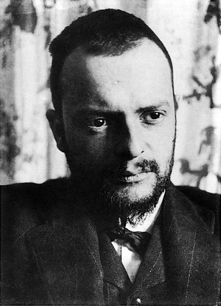
Over the years, Klee’s work has been categorized as Expressionism, Cubism, Futurism, Surrealism and Absurdism. But his unique point of view, which incorporates geometric forms and a raw, childlike quality, set him apart from his peers. Klee taught at the Bauhaus school from 1921-1931, and the termination of his teaching role segued him into his most vivacious period of creation, where he created upwards of 500 works in one year.

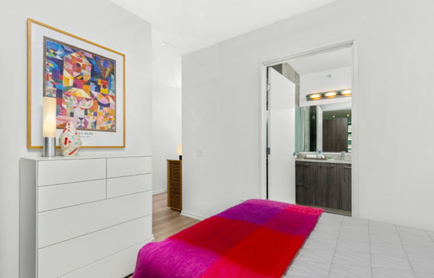
Paul Klee’s Garden View at Optima Signature

From his extensive exploration of color theory to his pioneering and childlike style, Paul Klee is an influential artist whose influence spans far beyond his lifestyle.

The Work of Piet Mondrian

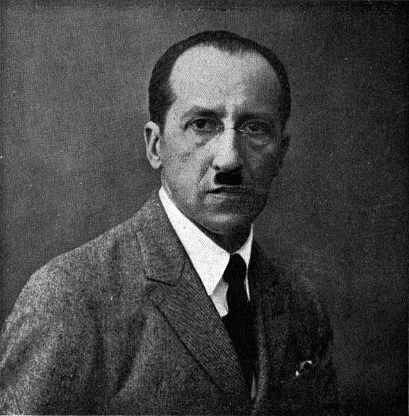
Piet Mondrian is widely regarded as one of the greatest artists and theoreticians of the 20th century. His boldly abstract works exemplified the pinnacle of Modernism’s bare bones, so much so that design historian Stephen Bayley once said, “Mondrian has come to mean Modernism.” Just what shaped Mondrian’s mindset, and what led him to the farthest reaches of abstract art?

The Life (and Work) of Piet Mondrian

Piet Mondrian (Pieter Cornelis Mondriaan) was born in the Netherlands in 1872 into a strict Protestant upbringing. His life was tinged with spirituality even after he left his religious childhood in favor of art school at the Academy for Fine Art in Amsterdam in 1892. His art began as heavily inspired by the surrounding Dutch landscape and impressionist style, including subjects like windmills, rivers and fields. These representational works had Mondrian dabbling in pointillism and the vivid colors of Fauvism.

Throughout the early 20th century, his style evolved to depict abstract trees in broad, sweeping fields. In these paintings, he began experimenting with primary color palettes and emphasizing form over content. In 1908, Mondrian encountered theosophicalism, and this continued search for spiritualism in many philosophies greatly influenced his artistic thinking moving forward.


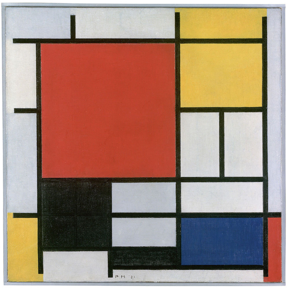
Composition en rouge, jaune, bleu et noir, Piet Mondrian, 1921
Composition en rouge, jaune, bleu et noir, Piet Mondrian, 1921. Photo in Public Domain.

Once Mondrian moved to Paris in 1911, he became fascinated with the avant-garde. Influenced by Picasso and George Braque, his paintings began to lean towards geometric shapes and interlocking planes, naturally absorbing Cubist influence. From there, the iconic Mondrian pieces emerged that we’re all so familiar with. His renowned style appeared in 1920, with bold lines and geometric shapes filled with vibrantly hued primary colors (hues which he always mixed himself).

Even after Mondrian left Paris in 1938 to escape rising facism, he continued to refine his geometric, abstract compositions in London and New York, where he lived out the rest of his life. His celebration of simplicity and form was more than just an art form — it was a philosophy. In his own words, Mondrian described it:

I believe it is possible that, through horizontal and vertical lines constructed with awareness, but not with calculation, led by high intuition, and brought to harmony and rhythm, these basic forms of beauty, supplemented if necessary by other direct lines or curves, can become a work of art, as strong as it is true.

The Work of Pablo Picasso

One of the world’s most iconic creators, Pablo Picasso is globally known as one of the most influential artists of the 20th century. His brightly-colored work adorns the walls of our Optima buildings, and today we dive into his life and work.

Pablo Picasso
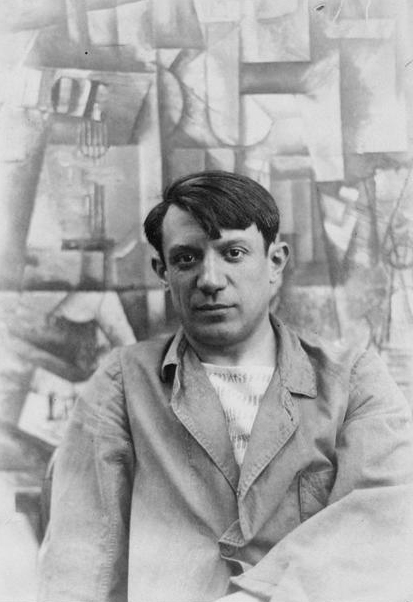
Pablo Picasso, 1912. Photo in Public Domain

A Promising Start

Born in Spain in 1881, Picasso was a gifted artist from a young age, receiving lessons early on from his father, who was also a painter. While trained and mentored in academic realism, by the time Picasso was sixteen, his interpretation of Modernism began to attract attention within the art world. Picasso struggled with the close influence of his father, who he fought with frequently, and eventually bounced back and forth between Spain and France to pursue his own distinguished style.

An Expansive Body of Work

Throughout his life, Picasso became known for his range of distinctive styles and contributions to various art movements. His work covered Cubism, Surrealism, Neoclassicism, as well as his famous Blue Period and Rose Period. Having lived in Europe through both World Wars, Picasso’s work is reflective of a world changing rapidly and drastically. While living in a German-occupied Paris during World War II, Picasso continued to create paintings and sculptures, despite the fact that his work did not fit the Nazi ideal of art. By the time Paris was liberated, he was already an international celebrity within the art world, a reputation that continued to grow.

Picasso sculpture in Daley Plaza, 1967. Credit: Dan DeLuca on Flickr Creative Commons, CC BY 2.0 Deed

A Lasting Legacy

Throughout his life, Picasso refined his mastery of painting, sculpting, printmaking, ceramics and stage design, while also dabbling in poetry and film. His art came with a turbulent personal life, including a web of muses, mistresses, wives and grandchildren, which proved complicated when it came to his estate after he passed away in 1973. His legacy was one of rigorous exploration and zealous creativity, solidifying his name as one of the world’s greatest artists.


The Work of Le Corbusier

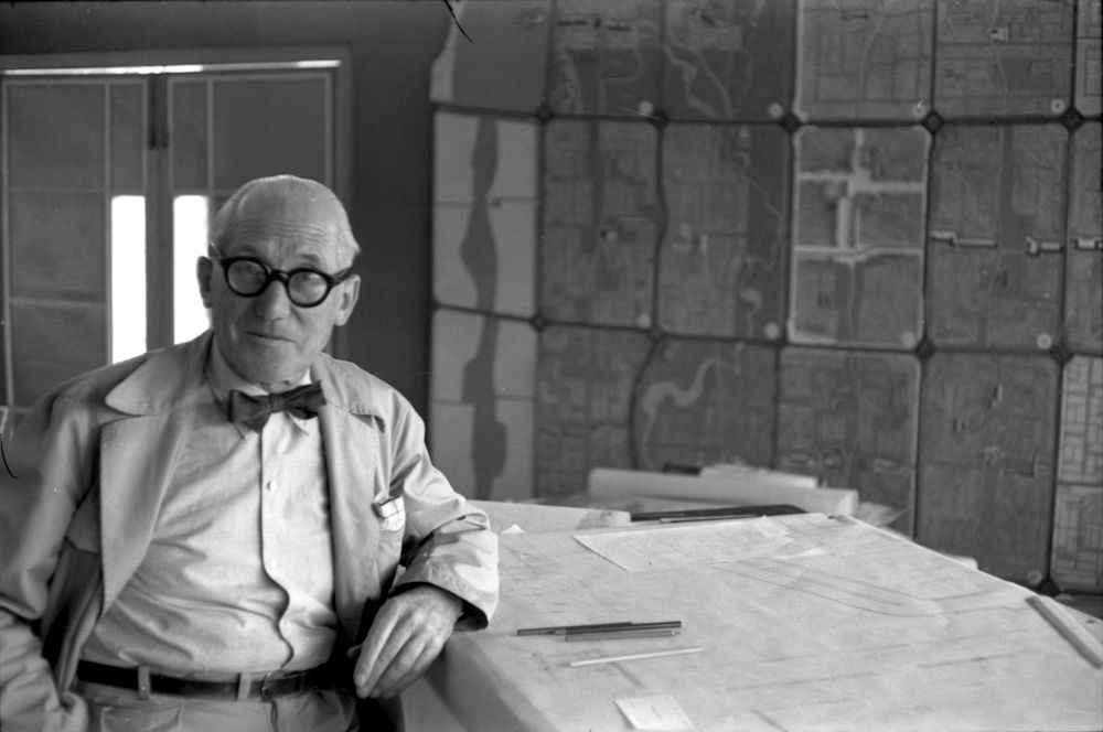
Modernism is an approach that has roots going all the way back to the 1920s. Modernist architecture was pioneered by the inventive and contentious Le Corbusier, a Swiss-French architect, urban planner, painter and furniture designer. To better understand Modernism, we’re diving deep into his life, and highly controversial work.

A Controversial Figure

Born Charles-Eduoard Jeanneret-Gris, architect Le Corbusier built chiefly with steel and reinforced concrete, paring design down to its simplest, elemental geometry and form. He developed his famous theory of modern form and minimalist materials when envisioning affordable, prefabricated housing to help rebuild communities after World War I. His vision for prefabrication was only the tip of a strong, nearly utopian, approach to urban planning and architecture.

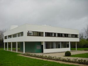
Villa Savoye Exterior
Villa Savoye in Poissy, Le Corbusier. Photo Timothy Brown, Flickr Creative Commons

His architectural philosophy was groundbreaking and completely contrary to the dominant narrative of the 1920s. Once he established his ideas, he shared them by publishing the seminal L’Espirit Nouveau (1920), where he revealed his famous “five points of architecture.” Three years later, he published Vers une architecture (Towards a New Architecture) (1923), in which he espoused a new, modern architecture informed by applying principles of cars, planes and ships to buildings. Le Corbusier embraced the conflict that arose to his ideas head-on, making bold declarations such as “a house is a machine for living in” and “a curved street is a donkey track; a straight street, a road for men.”

Chair designed by Le Corbusier at Optima Camelview Village

Form, Function, Furniture

Le Corbusier also designed furniture, his approach following suit to his approach to architecture. His furniture, co-designed with Pierre Jeanneret and Charlotte Perriand, utilized tubular steel that projected a new rationalist aesthetic. Le Corbusier broke down furniture into three types: type-needs, type-furniture and human-limb objects. His rational approach was not without romanticism, as he said, “Certainly, works of art are tools, beautiful tools. And long live the good taste manifested by choice, subtlety, proportion and harmony.” 

At Optima, we employ Le Corbusier furniture in our communities, like those in each of the three building lobbies at Optima Old Orchard Woods in Skokie. The furniture functions just as the artist would’ve wanted — as bold, artistic statement pieces, and as functional, rational furniture.

The Work of Jules Olitski

Jules Olitski was an American painter, printmaker and sculptor whose work explored color as a subject. Olitski’s innovative experimentation in paint and its properties yielded results that were at once atmospheric and beautiful. In many of our properties, displaying the work of Jules Olitski plays complement to our own exploration of color, form and function. 

The Life of Jules Olitski

Jules Olitski was born Jevel Demokovsky in 1922 in Snovsk, Russia (now Ukraine). His birth came just a few months after his father, a commissar, was executed by the Soviet government. At only a year old, along with his mother and grandmother, Olitski emigrated to the United States, where the family resided in Brooklyn. Even at a young age, Olitski demonstrated an aptitude for art. In high school, he won a juried prize that allowed him the opportunity to attend art classes in Manhattan. 

In 1939, at 17, Olitski attended an exhibit at the New York World’s Fair, and it was there that he first saw work by Rembrandt. Olitski described the experience as “transformative.” The budding artist delved into the academic art world to study portraiture, but his schooling was interrupted when Olitski was drafted into the army during World War II.

Luckily, the G.I. Bill allowed Olitski to spend time studying in Paris following the war. The Paris schools were Olitski’s first introduction to the European modern masters. Their modernist approach led Olitski to engage in a deep process of self-analysis and reinvention — a process which involved painting while blindfolded, enabling the artist to unlearn his academic training as a portrait painter and freeing his inhibitions.

The Art of Jules Olitski

After school, his originally classical work became more abstract and focused on the surface, color and physical properties of paint and painting. This process-oriented approach led him to express a desire to create “color that would hang in the air.” To do so, he rented an industrial spray gun that allowed him to experiment and discover a radical new technique of layering atmospheric blankets of thick color onto canvas. 

Olitski’s unique approach to the canvas helped establish the movement of Color Field painting in the mid-1960s. It also led him to represent the U.S. in the 33rd Venice Biennale in 1966, and to become the first living American artist to showcase a one-person exhibition at the Metropolitan Museum of Art in 1969. His work has been described as “visual drama” and “visual muzak” by international art critics.

Olitski was able to learn a classical approach to art, and then subvert that through his own unique innovation. Having his works on the walls of our own properties reminds us to always challenge the status quo, and to never stop inventing. 

person name goes here

Maintenance Supervisor

Glencoe, IL


    Acceptable file types: *.pdf | *.txt | *.doc, max-size: 2Mb