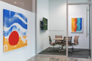
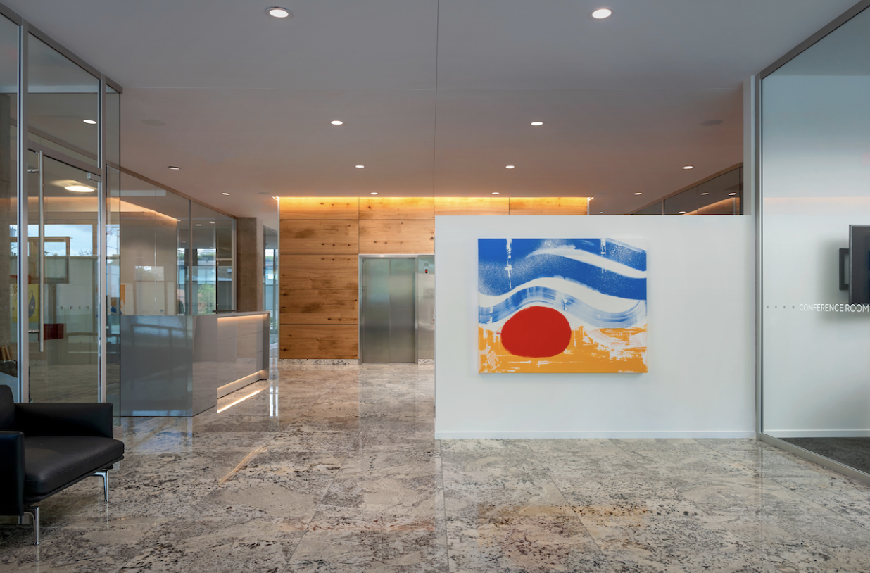
At Optima®, art is a piv-otal part of our design philosophy, breathing life into our spaces and making them more than simply places to live. We recently sat down with Ellison Keomaka – the artist behind the captivating work in Optima Lakeview and Optima Kierland Apartments – to delve into his creative journey, inspirations, and his special bond with Optima. In our conversation, he shed light on his process of creating the artworks exhibited at Optima Verdana, turning each corner into an expressive play of shapes and hues below:
What did the creative process entail when first conceiving and planning the artwork for Optima Verdana?
The artwork for Optima Verdana followed the work I created for Optima Kierland 7190. Interestingly, I integrated a few ideas and inspirations from my 7190 artworks into the pieces I crafted for Verdana. However, with the Verdana artwork, I wanted to integrate more of the earthy, verdant tones associated with the community.

We’ve understood that you frequently experiment with diverse materials ranging from soil to fabric to add texture to your artwork. What materials did you utilize for these specific pieces, and why?
I’ve been combining old and new elements in my work since my pieces for Lakeview and Optima Kierland 7180. I feel that this technique has been refined further in these new projects. For World Scapes in Optima Verdana, I created pieces measuring 20 by 30 inches, which is smaller than the pieces where I’ve previously incorporated magazines. It’s neat because I ended up fitting entire magazine ads in each piece, which ended up having a huge impact.
It’s fun working with smaller pieces because they create a whole new vibe compared to the larger 48 by 60-inch pieces where I’ve had to stick a bunch of ads together to make it stand out. So using magazines on smaller canvases, like in World Scapes, introduces a refreshing dimension to the work. What I truly cherish about this work is the fusion of vintage and modern elements. The color of the paper, with its earthy tone, contrasts remarkably with the bright, modern colors.

I also utilized magazines for the Portals series at Verdana. These pieces consist of magazine clips I discovered that convey a sense of motion. Creating these pieces was quite a challenge. I needed to adhere the images to the canvas, and only after that do they get cut out. I drew the black lines first and applied the yellow background, then cut the images to fit the black lines. It was a delicate balance – waiting for the glue or polymer I use to reach the right level of dryness so I can still cut it. So those pieces were rather complex to create.
What role does color play in these works?
Verdana stood out with its characteristic earth tones, marking a slight shift from the vibrant tones used in my work for other Optima buildings. My goal was to use more complementary colors to accentuate the warmer hues while preserving the vibrancy. I didn’t have a full understanding of the building’s size or the amount of art it would host, but I knew that Verdana was smaller. So, my approach was to focus more on the details and textures, magnifying them since they were less in quantity. The goal was to create an engaging experience for the residents.

Blossoms are some of my favorite pieces that embody the earthy tones used throughout Verdana. They abstractly represent a cherry blossom tree. I’ve tried to deviate the image as much as possible from a recognizable tree, but I’ve preserved some elements like the blue texture, reminiscent of bark. Instead of literal flowers, I’ve scattered colorful dots throughout the piece, with a hidden explosion of color behind it all for contrast against the bright pinks.
In the Around series at Verdana, you can see how I continued to experiment with different hues – the teal juxtaposed with a pinkish-mauve tone. These pieces were created using a unique type of graffiti ink pen. The pen’s shape left a more rounded edge to the strokes. Every piece is designed to fulfill a certain narrative, and in that journey, there’s always something that I find gratifying, whether it’s the balance, color, or textures. However, these pieces hold a unique place in my heart.
Is there anything else we should know about the creative process for these pieces or the work itself?
Creating a few of the pieces was extraordinarily challenging. One of the pieces in the Spring series stands out due to a five-minute variation in the timing of the spray application while the paint was still wet. I used a pressure sprayer and experimented with different paint viscosities to achieve the desired effect. Despite the difficulty, I love that they invoke a fresh, spring-like sensation. Since they’re smaller, I wanted to incorporate more texture into them. They feature different colored dots and are strongly influenced by Calder and Miró.

